New Feature: Redesigned Story Page
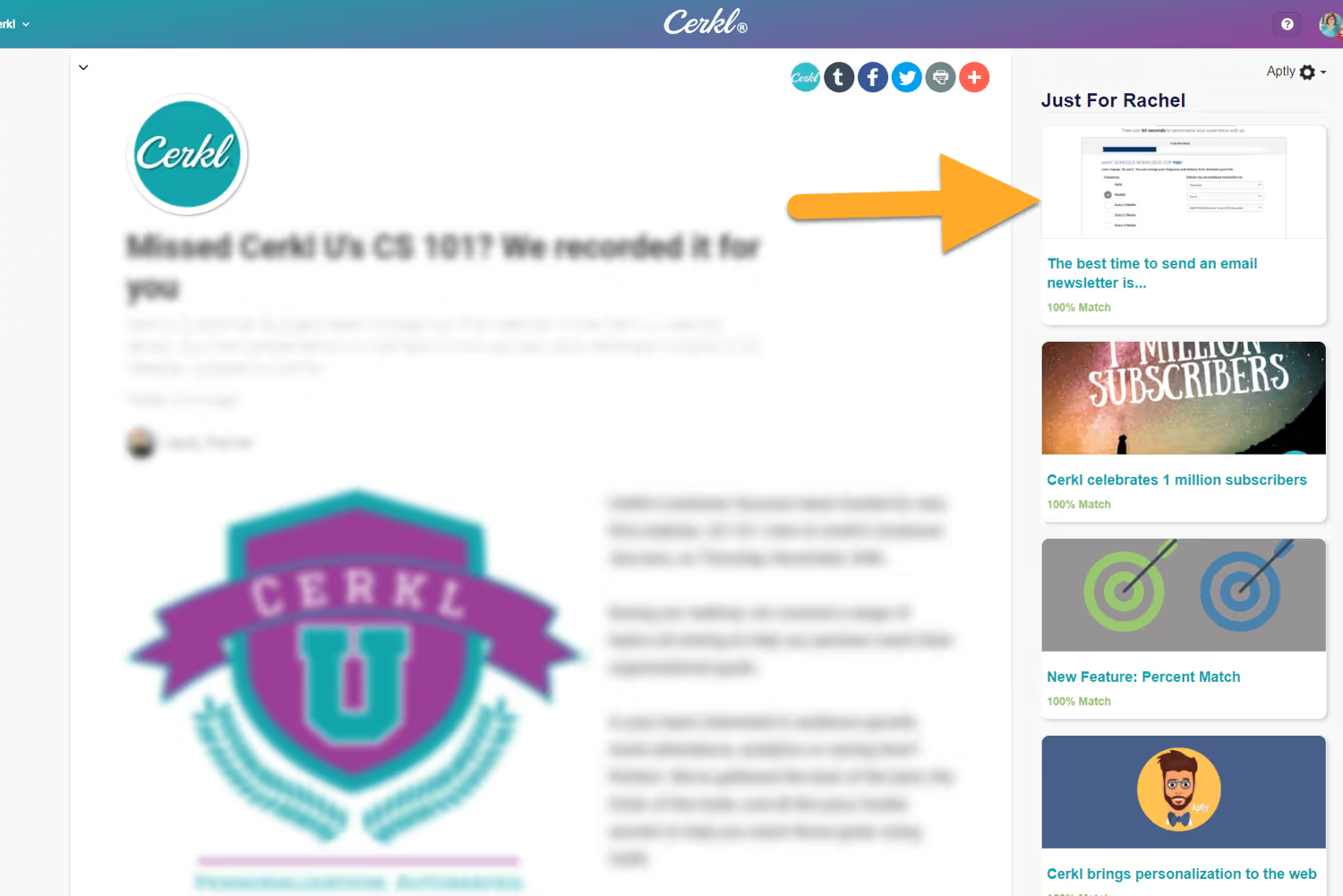
Content pages inside the Cerkl content management system have a beautiful new design.
What’s New in Cerkl's Story Page?
Aptly, Cerkl’s free web personalization engine, now appears on the right-hand side of the page to help keep your subscribers engaged with multiple pieces of content. This includes personalized recommendations based on the user’s interests and previously read articles, while also showcasing trending content.
This design also includes your branding, front, and center, to highlight your organization in each piece of content.
A subscribe button is also included at the end of each page to prompt interested readers to join your Cerkl. If the reader already subscribes, then this is the place they can edit their preferences.
As you might have noticed, there are some different image sizing restraints than before.
Anything wider than 1.5:1 will be used as a Wide Cover Image (more like a rectangle). All other images closer to 1:1 will be used as an Inline Hero Image (more like a square).
PRO TIP: JPGs work best for the 1500×1000 cover photo. PNGs may be too large.
What's Next?
This update is a collaboration of two Cerkl interns, Sam Huber and Jacob Hammerle, both interactive media studies students at Miami University, who focus on User Interface design.
See how this update will provide a more visually appealing experience for your subscribers and book your demo today.


