How to Create Mobile-Friendly Email Designs for Employees
How to Create Mobile-Friendly Email Designs for Employees
This article discusses optimizing internal emails for mobile viewing. It focuses specifically on email formatting and responsiveness. The challenge centers on email usability. It aligns with email execution optimization.
Written By:
Cerkl Research Team
Published:
October 1, 2025
Using Outlook or Gmail for your internal communication?
Foundations is free (forever) - purpose built for internal comms and includes everything you need to level up your game (email builder, analytics, pulse surveys and much more).
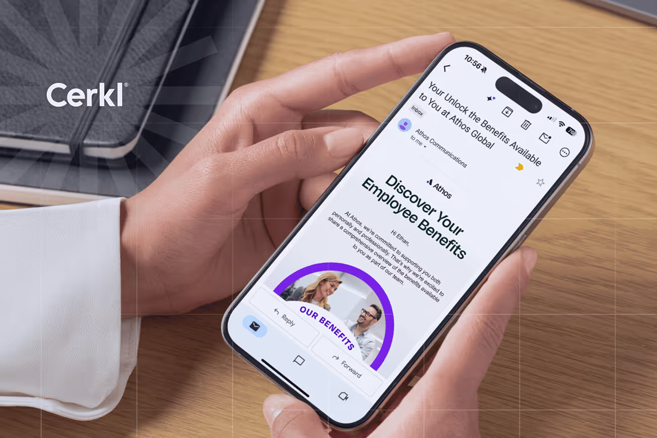
Mobile-friendly internal emails are employee communications designed for smartphones and tablets. They use responsive layouts, scannable content, and thumb-friendly interactions to ensure every worker can read and engage regardless of device.
They matter more than ever with the rise of deskless and frontline employees, many of whom lack traditional inboxes but still rely on timely, accessible updates to stay informed.
Key design practices include concise content, larger fonts for readability, single-column responsive layouts, and clear call-to-action buttons optimized for mobile use.
Distribution strategies such as employee mobile apps, personalized digests, and push notifications extend communication beyond email, reaching workers in low-connectivity or non-desk environments.
Measuring success through analytics that include open rates, click-through rates, time spent reading, and device engagement all ensure organizations can continuously refine their mobile-first approach to maximize employee connection.
Internal email remains a cornerstone of employee communication, as all the leading research confirms. However, how it’s consumed has changed dramatically.
According to the Litmus 2025 Guide to Creating Accessible Emails, nearly half of all email opens happen on mobile devices. This means that smartphone screens now serve as the first point of contact for crucial workplace updates. The implications are that even the most thoughtful internal message can fall flat if it’s hard to read, slow to load, or poorly formatted for small screens.
According to Statista, by 2027, there will be 4.89 billion email users worldwide. The CloudHQ Email Statistics Report 2025-2030states that the mobile open rate is estimated at 78%, meaning nearly four out of five email views occur on mobile devices. Additionally, device preference data from emailmonday shows that 81% of consumers regularly open and respond to emails on smartphones, and 21% regularly use tablets.
To keep employees informed and engaged, no matter where or how they work, mobile-friendly email design is now a critical must. As mobile usage rises and workforce expectations shift, internal communicators need to ensure every message is accessible, legible, and actionable from the palm of an employee’s hand.
This post explores what mobile-friendly email for employees is, why it matters for modern, deskless, and on-the-go workforces, and how it differs from traditional desktop-focused communications. We’re going to cover best practices for content layout, readability, and responsive design, as well as strategies for distribution, engagement, and measurement.
Whether you’re creating your first mobile-optimized template or refining an existing approach, we aim to help you deliver internal emails that are readable, accessible, and effective, regardless of what device your employees use.
What Are Mobile-Friendly Internal Emails?
Mobile-friendly internal emails are employee communications specifically designed to be easily read and acted on from smartphones and tablets. These emails use responsive layouts that adapt seamlessly to smaller screens, concise and scannable content, and design elements that support quick interaction on the go. Their purpose is to ensure every employee, regardless of device or location, can access, understand, and engage with key information without friction or frustration.
The employee inbox is no longer tethered to a desktop. From shift workers checking schedules to remote staff reading leadership updates on the go, mobile has become the default device for internal communications. In 2025, failing to optimize for mobile isn’t just an oversight, it’s a missed opportunity. It stands to reason that messages that aren’t mobile-friendly are more likely to be ignored, misunderstood, or misformatted in ways that frustrate the reader.
As Apple’s Human Interface Guidelines tell us very clearly, scalable text and properly spaced layouts aren't just nice to have; they’re essential for clarity and usability on mobile devices. Designing with mobile devices in mind ensures that all employees, regardless of location or device, receive the information they need in a way that’s accessible and effective.
These principles apply on Android, iOS, and webmail alike.
Why Mobile-Friendly Internal Emails Matter for Today’s Workforce
The way employees work and access information has shifted dramatically. While knowledge workers at desks still tend to check email on laptops, a growing share of the global workforce operates on the move. Furthermore, they continue to do this without consistent access to desktops or even company email accounts. This includes frontline and deskless workers in industries like healthcare, manufacturing, retail, logistics, and hospitality, who make up nearly 80% of the global workforce. For these employees, the reality is that mobile phones are often the only digital touchpoint they have with their organization.
Even among office-based staff, work doesn’t always happen at a desk. Employees increasingly check updates while commuting, between meetings, or from home, making engagement “on the go” a business necessity rather than a bonus. If internal emails aren’t optimized for mobile devices, these moments of potential connection are easily lost. Difficult-to-read layouts, slow-loading images, or misaligned buttons frustrate users and drive disengagement.
In stark contrast, mobile-friendly internal emails ensure reach, clarity, and accessibility, so that every employee, regardless of role or device, can stay informed and involved. Failing to optimize for mobile puts communication at risk, especially for workers already operating at the edge of traditional communication channels.
Foundations gives internal communicators a drag-n-drop email builder plus 10+ internal comms email templates. Say goodbye to fighting Outlook/Gmail formatting! Oh, Foundations is free (forever).
How Mobile-Friendly Employee Emails Differ from Regular Emails
Internal emails designed for desktop viewing don’t always translate well to mobile screens. What looks clean and well-formatted on a desktop monitor can become cluttered, unreadable, and frustrating to interact with on a phone. That’s why mobile-friendly emails require a different design mindset that prioritizes responsiveness, simplicity, and accessibility.
Instead of shrinking desktop emails down to fit smaller screens, these messages are purpose-built to work seamlessly in a mobile-first environment.
Here’s how mobile-friendly email for employees differs from standard desktop-focused designs:
Responsive vs. static layouts: Mobile-friendly emails use responsive design techniques that automatically adjust formatting, images, and columns to fit the screen size of the device being used. Static layouts, common in desktop-first emails, can break or require zooming on smaller devices.
Scannable, concise content takes priority: Mobile design favors brevity, with short subject lines, small paragraphs, and bullet points. This approach makes key messages easy to digest at a glance.
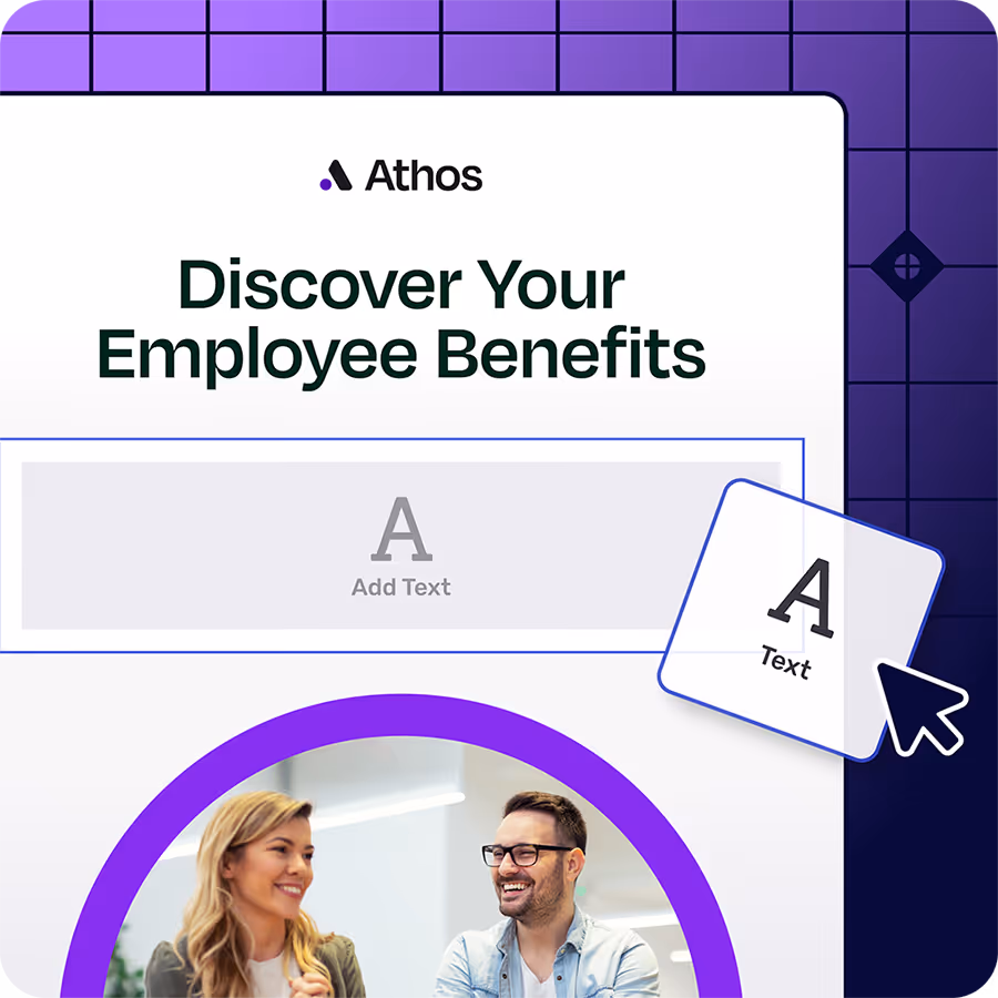
Visuals, buttons, and font sizes are optimized: Images are scaled for fast loading and clarity on smaller screens. Buttons are larger and easier to tap. Fonts are typically set to a minimum of 14–16 pixels for readability without the need to zoom in.
Mobile-first interaction design: Calls-to-action (CTAs) need to be “thumb-friendly,” with sufficient spacing and alignment. Content should be stacked in a single-column layout to support vertical scrolling and prevent horizontal navigation.
Creating Mobile-friendly Email Designs
Designing for mobile doesn’t mean shrinking desktop content to fit. Instead, it means rethinking how employees engage with information on smaller screens.
The issue is that a mobile-friendly internal email is not only responsive, but intentional. It prioritizes clarity, speed, and accessibility. Whether you’re sharing critical updates or company news, the design should make it easy for employees to read, tap, and act without frustration or delay.
Keep Content Short and Scannable
Mobile screens offer limited space for content, so clarity and brevity are key. Break your content into short paragraphs (1–3 lines max) and use bullet points or numbered lists to highlight key information. This helps employees quickly scan for what’s relevant while on the go. Keep each email focused on one primary message or CTA. The reality is that too many topics can overwhelm and reduce engagement.
According to the Litmus Email Marketing Design Best Practices, concise content and logical hierarchy are critical for mobile readability. This stands to reason, since it helps reduce cognitive load for readers navigating content on small screens.
Optimize for Readability
Nobody wants to have to squint to read an email on a small screen. This is why Google’s Material Design guidelines recommend a contrast ratio of at least 4.5:1 and touch-friendly font sizes to support universal readability on mobile devices.
Ideally, use a minimum font size of 14–16 pixels to ensure body text is easy to read without zooming. Fonts smaller than 12 pixels often render poorly or may be automatically resized by some mobile email clients (like Gmail on iOS), potentially distorting layouts.
High contrast color schemes, like black text on a white background, improve accessibility, especially in bright outdoor conditions or for users with low vision.
Also, don’t be tempted to rely on large images, which can slow load times or break rendering on poor connections. In any case, always ensure that the message makes sense even if images don’t load.
Responsive and Accessible Design
Mobile-friendly emails should always use single-column layouts to eliminate the need for horizontal scrolling. This approach will also ensure natural top-to-bottom content flow. Choose responsive templates that adjust automatically across screen sizes and orientations.
Every image should include alt text, both for accessibility (screen reader compatibility) and fallback clarity if images don’t load. Additionally, ensure buttons and interactive elements are announced properly to assistive technologies.
The Litmus 2025 Guide to Creating Accessible Emails, mentioned above, emphasizes responsive layouts and proper image markup (like alt text) as essentials for inclusive email design.
Engaging CTAs for Mobile
Any CTA should be clear, bold, and thumb-friendly. This means it should be large enough to tap - at least 48×48 density-independent pixels, which are a unit of measurement recommended by Google for Android devices, and surrounded by sufficient spacing. Use just one or two CTAs per message to avoid cognitive overload. Make sure every link or button leads to a mobile-optimized destination, so the experience doesn’t break after the click.
Distribution Strategies for Mobile-First Internal Emails
Designing mobile-friendly emails is only half the equation. Delivering them effectively to the right employees is just as important.
In many organizations, not all workers have regular access to email, especially those in frontline or deskless roles. That’s why mobile-first distribution strategies need to go beyond the traditional inbox, making internal communications accessible wherever work happens.
Whether through employee apps, push notifications, or cross-device content syncing, the goal here is to ensure every employee receives timely, relevant updates regardless of job function or connectivity.
Using an Employee Mobile App
A mobile app can be a powerful extension of your internal email strategy, especially for employees who don’t have a company email address. By integrating email content into an app, organizations ensure updates reach everyone, from warehouse teams to delivery drivers, without relying on inbox access.
As Thrive points out, some employee mobile apps also support push notifications that can result in significantly higher open and engagement rates than standard emails or intranet posts.
It’s worth recognizing that for urgent communications, push notifications offer a fast and direct way to capture attention in real time. Many apps also support offline access, allowing employees in low-connectivity environments (such as hospitals, warehouses, or remote fieldwork) to view messages once a connection is restored. This makes the app an always-available communication channel, bridging gaps where traditional email falls short.
Bridging Deskless and Email-Less Employees
For workers who are deskless or email-less, mobile-first content delivery must be flexible, personalized, and consistent.
Rather than relying solely on email threads, organizations can surface updates through app-based news feeds or personalized News Digests that aggregate relevant information in one scrollable view. These digests can be tailored by role, location, or shift pattern to reduce noise and boost relevance. Meanwhile, syncing content across devices, from smartphones to shared kiosks or tablets, ensures employees receive the same information in a format that fits their workday. This omnichannel approach supports ongoing engagement, even when inbox access isn’t part of the daily workflow.
Best Practices to Drive Engagement On the Go
Mobile-first communication isn’t just about design. It’s about relevance, timing, and interactivity. When employees engage with internal emails on mobile, they’re often multitasking or in motion, which makes targeting and timing crucial. To cut through distractions, internal communicators need to deliver messages that feel tailored, timely, and two-way. For this reason, it’s important to:
Segment content by role, location, or shift: Use audience segmentation to send updates only to the people who need them. For example, site-specific safety alerts or shift reminders should only go to affected teams-not the entire company.
Personalize to reduce noise: Personalized subject lines, employee names, or role-relevant content improve open rates and engagement. According to Litmus, personalized emails see a 50% higher click-through rate compared to non-personalized messages.
Time delivery around shifts and time zones: Scheduling emails when employees are most likely to check their phones boosts visibility. This is particularly important for distributed teams or 24/7 operations like healthcare, transportation, or manufacturing.
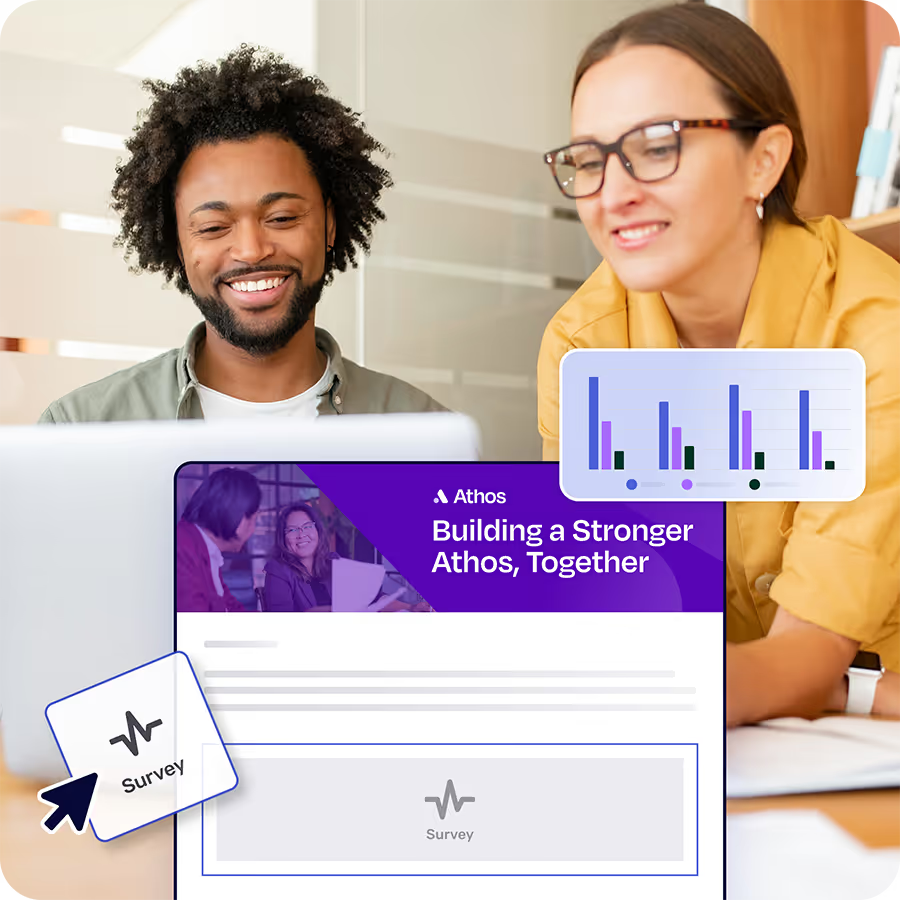
Encourage feedback loops: Mobile-friendly surveys, polls, or emoji reactions offer quick, low-friction ways for employees to respond. This turns internal email from a one-way announcement into a real-time feedback tool that captures sentiment on the move.
Measuring the Success of Mobile-Friendly Internal Emails
You can’t improve what you don’t measure, especially when optimizing for mobile. Tracking performance ensures your mobile-first strategy drives real engagement, not just aesthetic upgrades. The key is to combine traditional email metrics with mobile-specific indicators and use the insights to refine your strategy over time.
Core metrics: Monitor standard indicators like open rates, click-through rates, and time spent reading to understand message performance. High click-throughs often indicate clarity and strong calls-to-action, while low read times might suggest content overload or formatting issues on mobile.
Iterate based on insight: Metrics aren’t just for reporting. They should guide your next send. For example, if mobile click-throughs are low, consider testing button placement or increasing font size. If one segment consistently underperforms, you may need to adjust send times or refine personalization.
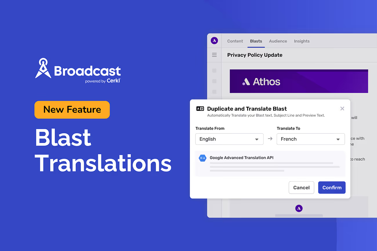
How Cerkl Broadcast Supports Mobile-Friendly Internal Emails
Designing and delivering mobile-friendly internal emails doesn’t have to be complex. Cerkl Broadcast equips communicators with the tools they need to reach every employee, no matter where or how they work. The results promise to be consistent, optimized experiences.
Drag-and-drop responsive email templates: Quickly create professional, mobile-ready messages without coding. Broadcast templates automatically adjust for smaller screens so every employee can read with ease.
Audience segmentation for deskless workers: Ensure the right updates reach the right employees, including frontline or deskless staff who often miss out on traditional email.
MyNews personalized mobile digest for on-the-go access: Employees receive tailored content in a single News Digest, making it easy to stay informed without email overload.
Mobile app integration with push notifications: Urgent announcements reach employees instantly, even those without company inboxes, supporting communication in real time.
Unified analytics across desktop and mobile: Get a complete view of employee engagement - tracking open rates, clicks, and content interactions in one dashboard - so communicators can measure performance and continually improve their strategy.
What’s Next
Now that you know how to design and distribute mobile-friendly internal emails, the next step is to optimize how employees interact with them. Strong design is only half the equation. Driving action through better open and click-through rates is what transforms communication into measurable business impact.
We know how challenging this can be, which led us to produce an internal email CTR guide to help people like you. And it’s absolutely free. You can download it right now to learn proven strategies that will boost employee engagement and ensure your mobile-friendly emails deliver results. What are you waiting for?
If you're frustrated with Outlook or Gmail for your employee emails, we understand.
That's why we built Foundations. Purpose-built for internal email with all the features you wish you had - drag-and-drop email builder, analytics, employee segmentation and much more. All for free (forever). No credit card, no contracts, no setup fees.
How to make my emails mobile-friendly? You can make your emails mobile-friendly by using a responsive template that automatically adjusts to different screen sizes and layouts. Keep the content concise, use larger fonts, and design clear, tappable buttons that are easy to interact with on smaller screens.
How do you format an email so it looks good on mobile? Format emails for mobile with a single-column layout, short paragraphs, and bullet points that are easy to scan. Ensure visuals are scaled for small screens, use high-contrast colors, and include alt text so content remains accessible even if images don’t load.
What is the size of a mobile-friendly email? A mobile-friendly email should be no wider than 600 pixels, which ensures it displays properly across most devices and clients. For text, a minimum font size of 14–16 pixels is recommended so employees can read without zooming in.
Did you enjoy this content? Please share it with your internal comms friends and colleagues. Just click on any of the links below.